How a broader business, changing customer needs and seven decades of experience shaped our next chapter.
A company can evolve for years before the way it presents itself catches up. New capabilities emerge. Customer conversations become more complex. Teams solve problems that extend well beyond the products that first established the business.
For Wikoff, our 70th anniversary brought that evolution into focus. Founded in 1956, we built our reputation through inks, technical expertise and close customer relationships. Over time, our capabilities expanded into advanced coatings, digital technologies, prepress graphics and broader technical services. Our identity needed to help customers see how those capabilities connect.
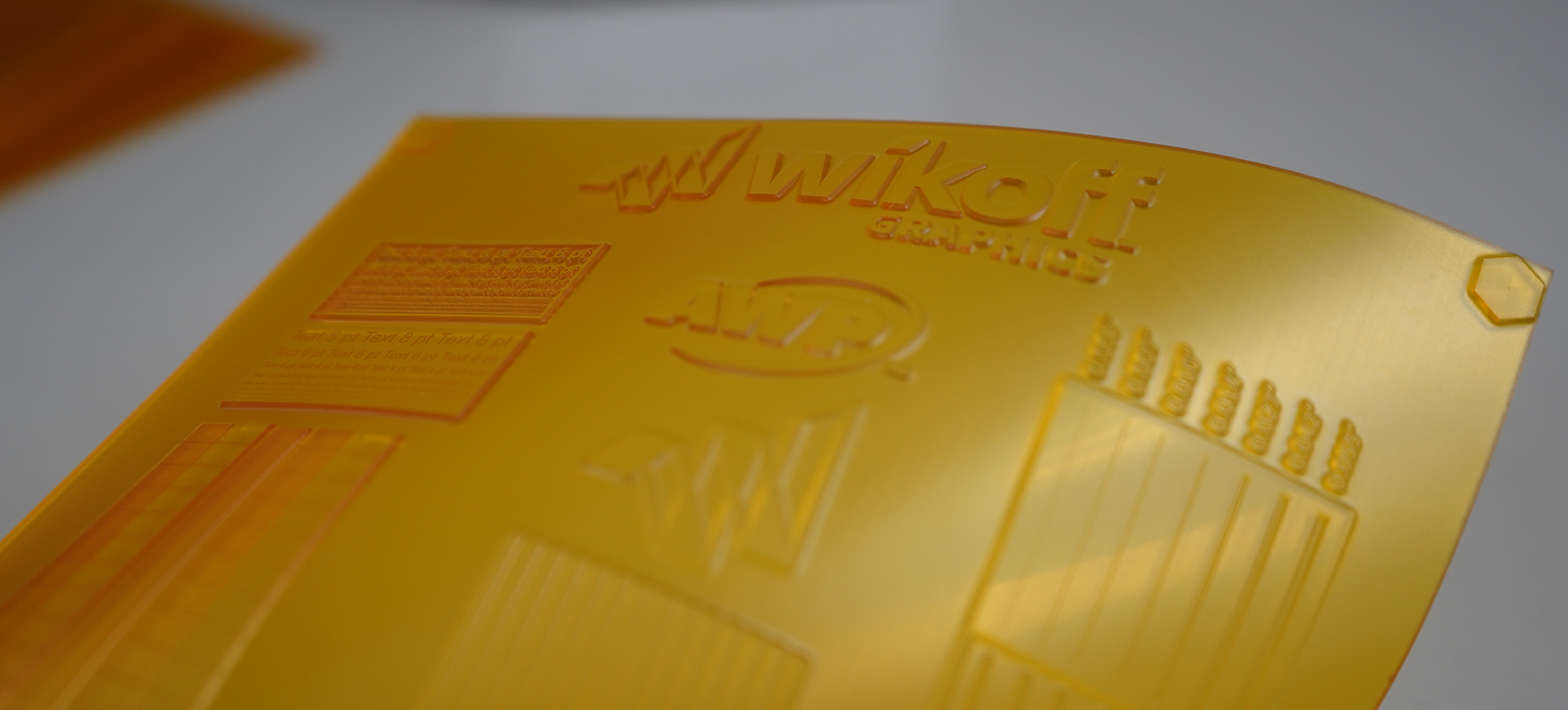
Wikoff Graphics illustrates that breadth. Its photopolymer plate business focuses primarily on flexible packaging and label and narrow web printing, complemented by coating plates for folding carton and specific plates for corrugated applications. These capabilities connect materials and technical expertise to the requirements of different printing markets.
In March 2026, we introduced a new brand identity, retired “Color” from our name and brought that broader story together under two words: Beyond Color.
Recognizing When a Brand Needs to Evolve
For an established company, a familiar name carries real value. It holds years of relationships, experience and trust. Changing it deserves careful consideration, particularly in an industry where consistency matters.
A useful place to begin is the relationship between what a company offers and what its identity helps people understand. Does the brand communicate the full value of the business? Does it give customers a reason to explore capabilities they may not already know? Can it support where the company is going?
At Wikoff, the reason for evolving was grounded in the business. Traditional ink manufacturing remained central to our work, while our role in customers’ operations had grown. A conversation about ink could lead to substrate compatibility, coating performance, digital integration, plate selection or process improvement. Presenting that expertise clearly required a broader story.
The marketing lesson is practical: a rebrand earns its purpose when it helps people understand a meaningful change in the value a company can provide.
Why the 70-Year Milestone Mattered
An anniversary creates an opportunity to consider both the history of a business and the demands ahead. For Wikoff, seventy years provided perspective on what had sustained us: craftsmanship, customer partnership, technical curiosity and the commitment of our people.
Those strengths also gave us a foundation for the next chapter. Our rebrand accompanied a multiyear enterprise transformation focused on aligning operations, modernizing technology and supporting scalable growth. A clearer identity helped communicate the direction of that work to customers, employees and partners.
The anniversary gave the story a meaningful moment. The evolution of the business gave it a reason.
Starting with the Story Behind the Identity
Our brand work brought together the elements that explain who Wikoff is and where we are headed: our mission, vision, values, brand story and the way we communicate. That foundation connected our heritage with a wider role across the printing and packaging workflow.
It also made employee ownership an essential part of the story. Ownership shapes how people take responsibility, collaborate and approach a customer’s challenge. It gives the brand a human foundation, rooted in the people who formulate products, support production and help customers improve performance.
For any organization considering a rebrand, this is valuable work to do before evaluating creative concepts. A clear strategic foundation gives teams a shared basis for judging whether a name, message or design represents the business and can be used consistently.
Giving Beyond Color a Clear Meaning
Beyond Color connects the expertise that built Wikoff with the broader capabilities we offer today. Color remains fundamental to print quality and brand recognition. Our opportunity is to help customers understand everything that supports the finished result.
Consider a converter introducing a new packaging application. Success may depend on how the ink performs on a particular film, how a coating supports the required finish, how the plate transfers the image and how the process runs on press. Each decision affects the others. Wikoff’s expanded capabilities allow us to contribute across more of that conversation.
For marketing, a broad promise becomes useful when it can be explained through specific customer needs. Beyond Color gives us a consistent way to connect our products, technologies and expertise to the performance customers are working to achieve.
Translating Strategy into Design
The visual identity carries that same thinking. Our multifaceted, origami-inspired symbol draws on the precision and intention required to transform a simple sheet into a dimensional form. Its folded structure expresses craftsmanship, movement and possibility, linking the work of making with the ambition to keep advancing.
The full-color mark maintains a visible connection to our heritage while giving Wikoff a distinctive expression for the future. Alongside it, the streamlined name provides room for the breadth of our business.
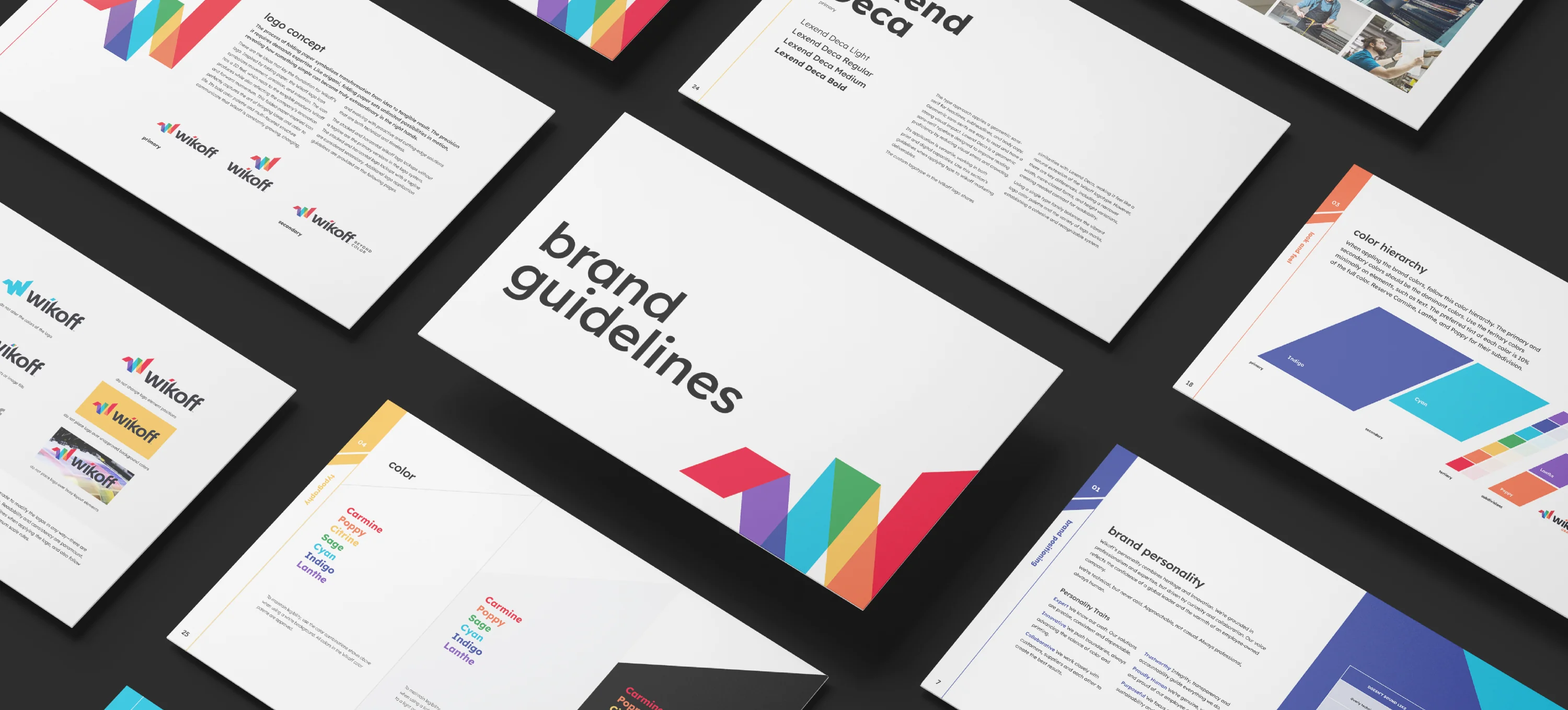
That thinking is documented in our brand guidelines, which we are sharing publicly for the first time alongside this post. The guide opens a window into the work behind our identity and provides a common reference for the people who represent Wikoff.
Sharing the Thinking Behind Our Brand
The guidelines begin with our mission, vision and brand story, connecting customer success with innovation, craftsmanship, partnership and employee ownership. Our six core values provide the foundation: Workplace Safety; Integrity & Accountability; Knowledge & Collaboration; Outstanding Quality; Forward Thinking; and Focus on Sustainability.
They also define our voice: knowledgeable, clear, collaborative and human. Technical expertise should help people understand their choices. Our communications should reflect the care and accountability customers experience when they work with our employee-owners.
The visual system turns that foundation into practical standards. It explains the folded-paper logo concept, approved logo configurations, clear space and correct use. A seven-color spectrum connects the identity to our heritage, with a defined color hierarchy and Pantone, CMYK, RGB and HEX specifications to support consistency across print and digital applications. Lexend Deca typography and guidance for legibility help information remain clear.
Photography and video guidance emphasize authentic people, real work, craftsmanship and accurate color. Examples for business cards, stationery, email signatures, presentations and advertising show how the system comes together, supported by asset access and approval guidance.
For a company working in printing and packaging, these details have particular relevance. We understand how many decisions sit between a creative idea and a consistent finished result. Our guidelines apply that same discipline to our own identity.
Explore the Wikoff Brand Guidelines: Download the PDF.
Making the Brand Useful Across the Business
The rollout extended across external and internal communications. The redesigned website, refreshed social channels, updated templates and documents, shared resources and One Wikoff communications helped carry the new identity into everyday use. Implementation across products, facilities, signage and digital platforms was planned in phases.
Previously, Wikoff, Wikoff Digital and Wikoff Graphics operated separate websites. Bringing them together at wikoff.com created one destination for our combined capabilities. Customers can explore the business more easily and see connections among inks, coatings, digital technologies, graphics and technical expertise.
Streamlined navigation, search and product discovery were central to the redesign. The goal was to make relevant solutions and expertise easier to find while giving the broader Wikoff story one consistent home. From a marketing perspective, unifying those experiences helps customers understand how specialized capabilities work together.
This is an important consideration for any rebrand: employees need usable tools, customers need clear information and the organization needs a practical transition plan. Consistent execution turns a strategic decision into something people can recognize and understand.
A New Milestone for the Wikoff Identity
We are also pleased to announce U.S. federal trademark registrations for our new identity. The horizontal and vertical Wikoff logos, each incorporating the stylized Wikoff name and multicolored symbol, were registered on September 15, 2026. Our standalone geometric symbol was registered on September 22, 2026.
These registrations mark another step in establishing the identity we are carrying forward. Alongside the guidelines and unified website, they reflect the care invested in building a recognizable, consistent brand for Wikoff’s next chapter.
Carrying the Promise Forward
The continuing measure of a brand is the experience behind it. For Wikoff, that means connecting expertise across teams, helping customers navigate technical choices and delivering the quality and collaboration our identity represents.
For businesses considering their own evolution, our experience offers a useful starting point: understand what has changed, preserve the strengths people trust, give the new direction a clear meaning and carry it through the places where people experience the company.
Seventy years gave Wikoff a legacy worth carrying forward. Beyond Color gives us a clearer way to express how that legacy continues to grow, through the people, technologies and partnerships helping shape the future of printing.
Explore Wikoff’s products, services and technical expertise at wikoff.com, or connect with our team to discuss your next printing or packaging challenge.